Peugeot
2015 - HMI Design Lead
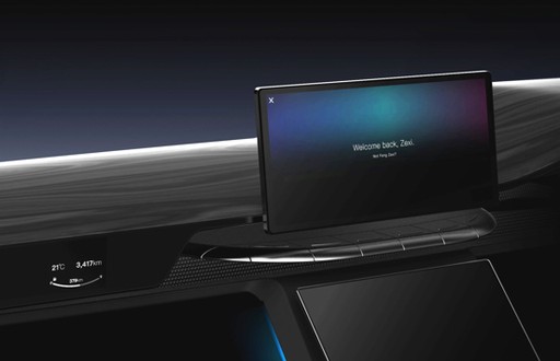
In late 2015, Groupe PSA, a leading French automobile manufacturer that sells vehicles under the Peugeot, Citroën, DS, Opel, and Vauxhall brands, began a collaboration with our lab (Center for Digital Innovation, Tongji University) to design a concept car’s human-machine interface (HMI) for the company’s next-generation product (2017). With all the new multi-sensory technology, PSA aimed to provide a better yet simpler solution for their customers.
I was the design lead on Tongji’s team, responsible for developing the HMI foundation and the immersive test environment. Building a more powerful and capable system with less user distraction was a challenging task, so we started by reimagining the way users interact with their cars.
Seeing the underlying issues.
Everything becomes a distraction while driving.
Analyzing the initial user research report from PSA, we identified the main touchpoints at the system level and mapped the related pain points. One of our most significant findings was that, for nearly all touchpoints, despite a few complaints about missing features or requested fixes, the top pain point was the slow and complicated interaction. It seemed that users were not enjoying any interactions on the touch screens inside their cars.
So, what now? Should we consider going back to analog controls? It didn’t seem like a good idea to put a physical keyboard on the steering wheel. To address the real issue, I posed a question:
Why are the features designed to be so complicated and frustrating?
I realized that the question was too vague and broad. The current touchscreen-based system is actually designed to be quite similar to the systems on smartphones that people use every day. There didn’t seem to be an answer within the UI and feature dimension, so I took a step back and started thinking on a deeper level. This time, I rephrased the question to focus on user behavior and cognition:
What makes interactions in cars feel more complicated and frustrating?
A straightforward answer to this question could be the complexity of the functionality. However, by digging a level deeper, I realized that the true reason lies in the higher cognitive load. Users struggle to interact with the system because driving itself is a demanding task that requires significant concentration, with safety being a critical priority.
The problem is that requiring users to navigate through menus to find what they need creates a significant distraction, which conflicts with the essential tasks of driving.
So the core issue is not just about optimizing the UI but also the interaction mechanism underlying the entire system.
Reimagine the foundation.
What if the system knows before you ask?
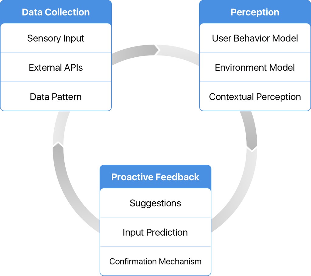
How might we improve the system-human interaction mechanism? We aimed to develop a generic framework to enable proactivity throughout the system. With the assistance of PSA engineers, I designed the proactive mechanism for our system.
The ideal process for proactive interaction consists of three phases. First, the process must be triggered by a specific input or data pattern. For example, the interior camera sensor might detect a new passenger, or the current time could match the car’s historical location data for that time on previous days.
Next, the system builds a perception model of user behavior, the environment, and the context. For instance, it might recognize that the rear seats are empty and the rear zone AC is on.
Finally, the system responds in various ways, such as suggesting or executing tasks. A confirmation process follows this response to provide feedback on the system’s data patterns. A simple example of this phase is when the system turns off the rear zone AC and marks this action as ‘positive’ since the user did not reverse the change.
We shifted our thinking from Human-Machine Interaction to "Machine-Human Interaction".
With the mechanism serving as a framework, we reimagined the basic user flows for the core features. Instead of users initiating the flow, the system now proposes task requirements to start the interaction and can even complete the entire flow automatically in certain cases, such as finding parking spaces in navigation when the car is approaching a new destination.
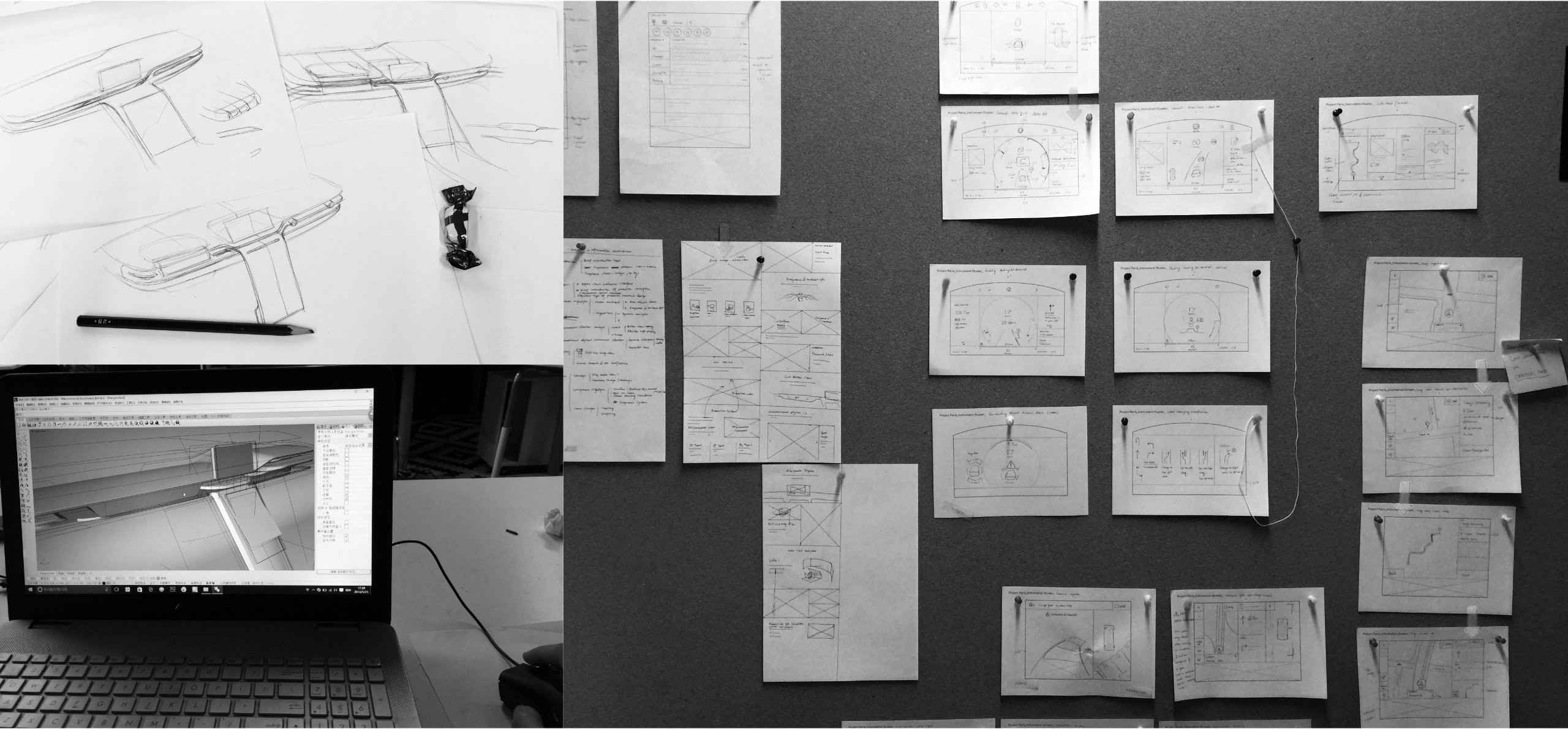
My team collaborated closely with the PSA test team to ensure that the new design was both concrete and technically feasible. The system is not just a sleek concept for showcase purposes but also serves as a guideline and roadmap for their next-generation product. We conducted several internal tests using the customized HMI Simulation Test Platform.
No need to dig.
Proactively surfacing what's needed.
With the system-wide proactive mechanism, relevant functions and data are displayed without the need for user input. The UI is designed to be neat and self-organizing, making most tasks accessible within a single step in their respective use scenarios.
Universal Smart Suggestion
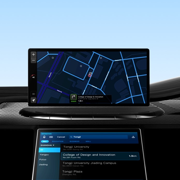
The system provides scenario predictions and task suggestions within various built-in apps, such as Navigation and Cabin Ambient. For example, the Navigation app might recommend the most likely destination and suggest a POI (Point of Interest) search based on environmental information. This suggestion-based approach is integrated into nearly every aspect of the infotainment system to minimize the need for user interaction.
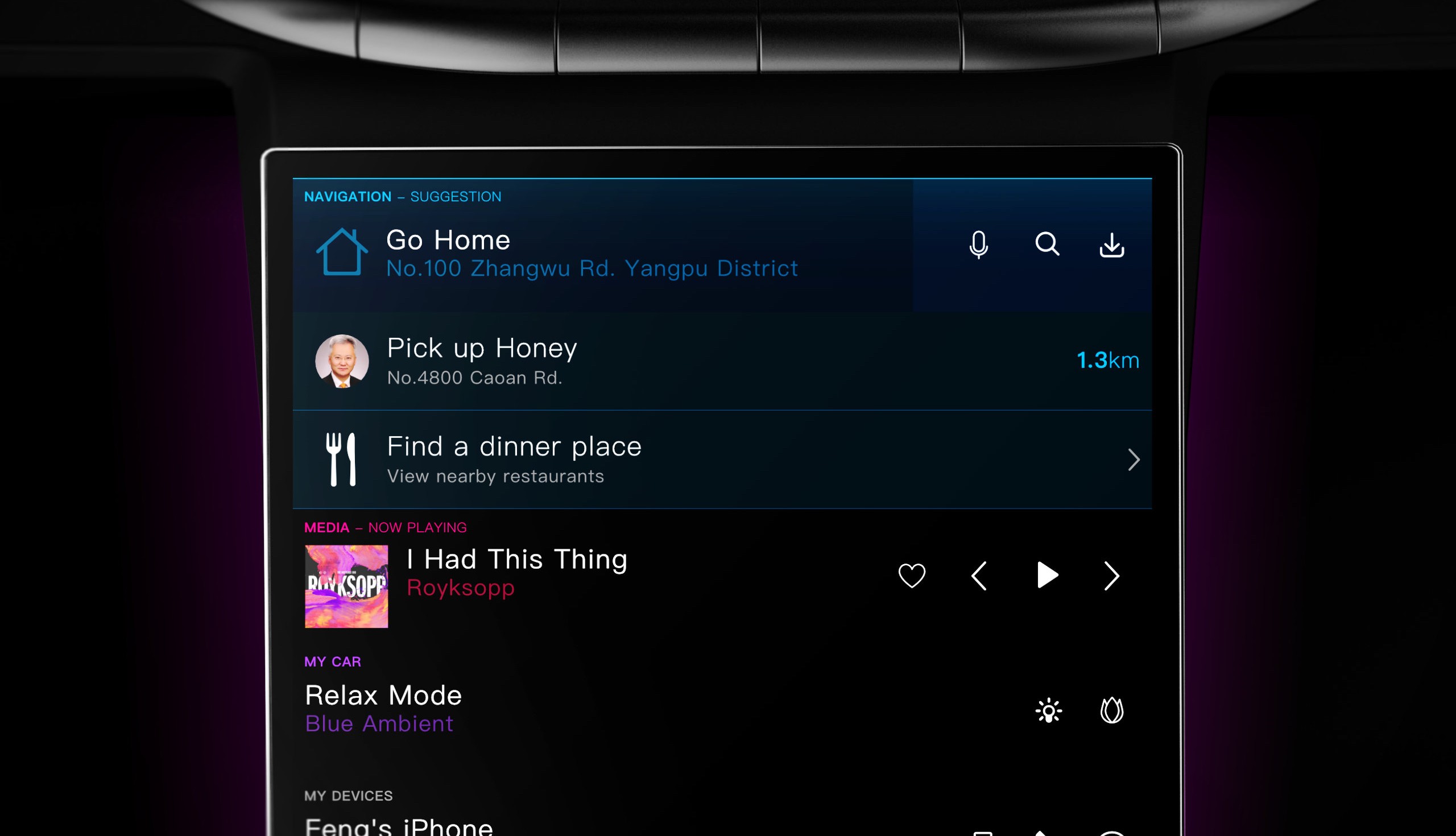
Additionally, in collaboration with the camera sensor and skin temperature sensor, the system can proactively adjust the ambient lighting, fragrance, and zone temperature.
Assistance Display
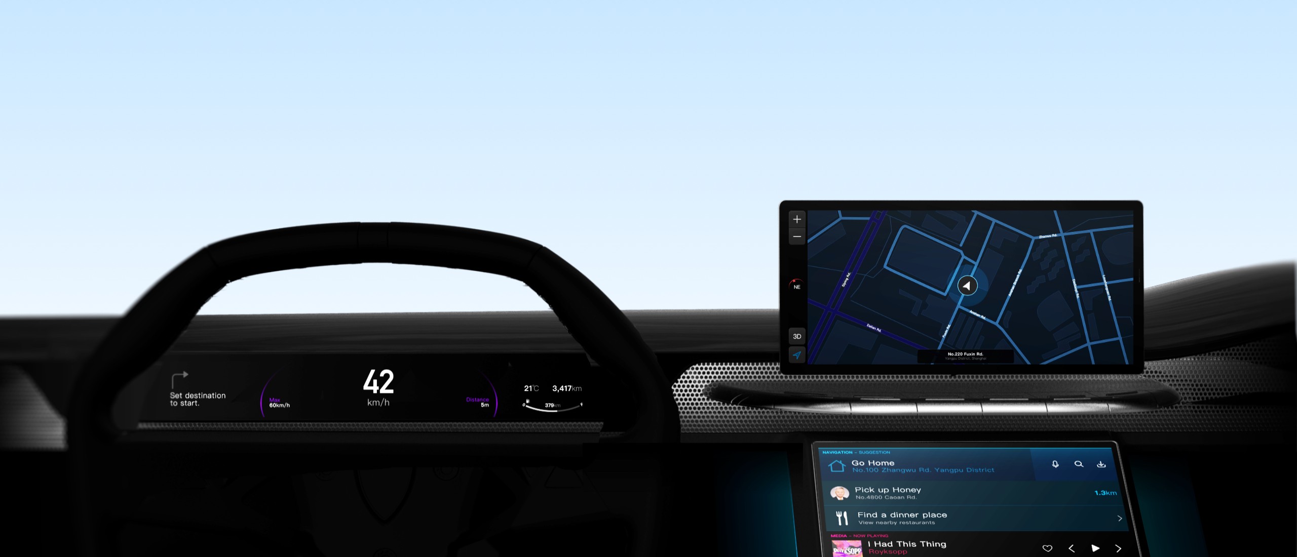
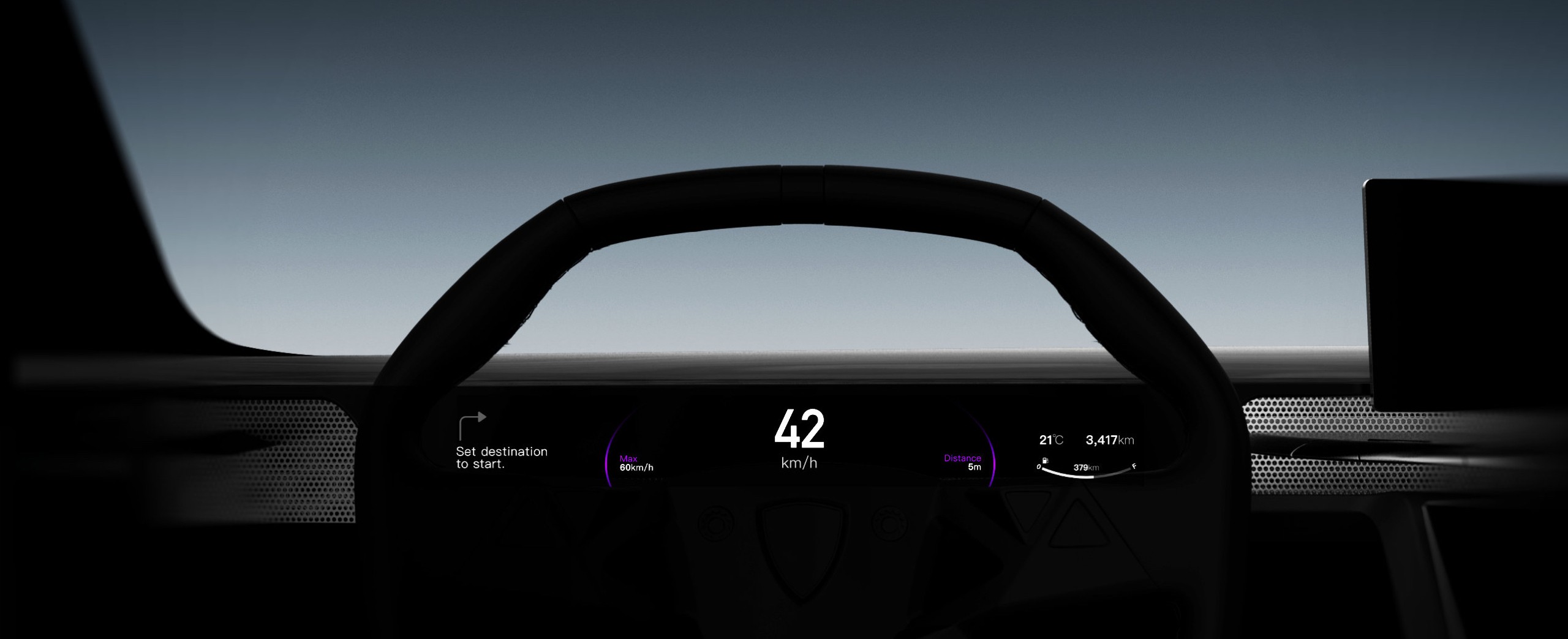
In addition to the vertical dashboard touchscreen, the assistance display located above the dashboard provides information and controls for time-sensitive use cases, such as turn-by-turn navigation or phone calls, directly within the driver’s line of sight.
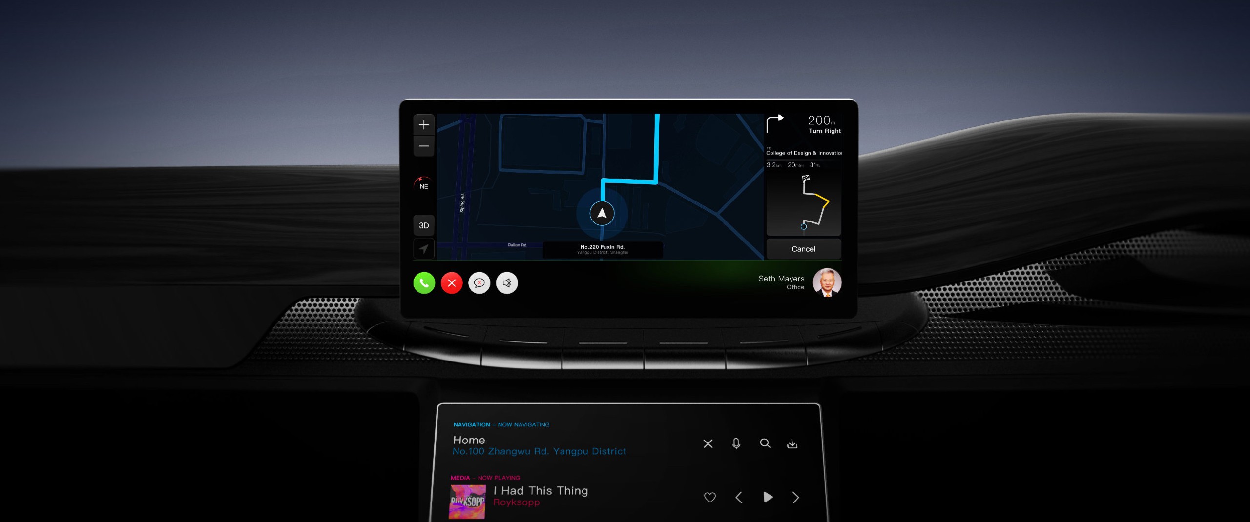
Instrument Belt
The instrument cluster was redesigned to be more adaptive and less obtrusive. Initially, we started with a windshield-projection HUD, but we found it difficult to read in some of our simulation scenarios. The reimagined belt-like display is positioned slightly lower than the windshield, offering the same low view obstruction as the HUD but with a larger canvas and improved visibility.
Reflection.
Innovation is the natural outcome of asking more profound questions, not merely the act of creating something different.
There are many different ways to approach a concept design project, each tailored to its specific purpose, but I believe that being innovative is never just a goal—it’s a practice. Innovation is a continuous process, a long-term design strategy that ultimately enables a design to achieve its objectives. In this concept development project, our purpose was to inspire, and our goal was to make the system more powerful yet simpler. We chose to take a different approach, not because we set out to be different, but because we asked more profound and insightful questions. Being different wasn’t the intention or strategy; it was the outcome of our journey to find the solution.

