Flex
2018 - Design Lead
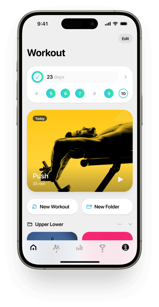
Designed for people who want to achieve their fitness goals, Flex is a tool that offers professional fitness guidance and powerful customization.
This project is important to me because it uses technology and design to help people achieve something better, rather than harvesting their attention through questionable addictive patterns. However, encouraging people to work harder and more consistently presents additional challenges in design. Simplicity and engagement have become the core of my strategy in building this tool from the ground up.
Stepping into a gym for the first time can often feel intimidating and overwhelming. My design aims to reduce the cognitive load by creating an approachable and delightful experience throughout the entire journey.
Come closer.
Be approachable, mentally and physically.
Progressing through one’s fitness journey requires a lot of learning, especially when trying out a new workout or customizing exercises at the gym. A self-explanatory interface with clear affordances ensures that people can focus on mastering the exercises rather than learning about the tool itself.
That’s why, for me, lowering cognitive load isn’t simply about removing content; it's about pacing people's learning experience. The need to bring order to complexity arises naturally from our use cases, making it essential to create a core experience that is simple while also developing intuitive interfaces for more advanced tasks.
"Simple things should be simple, complex things should be possible."
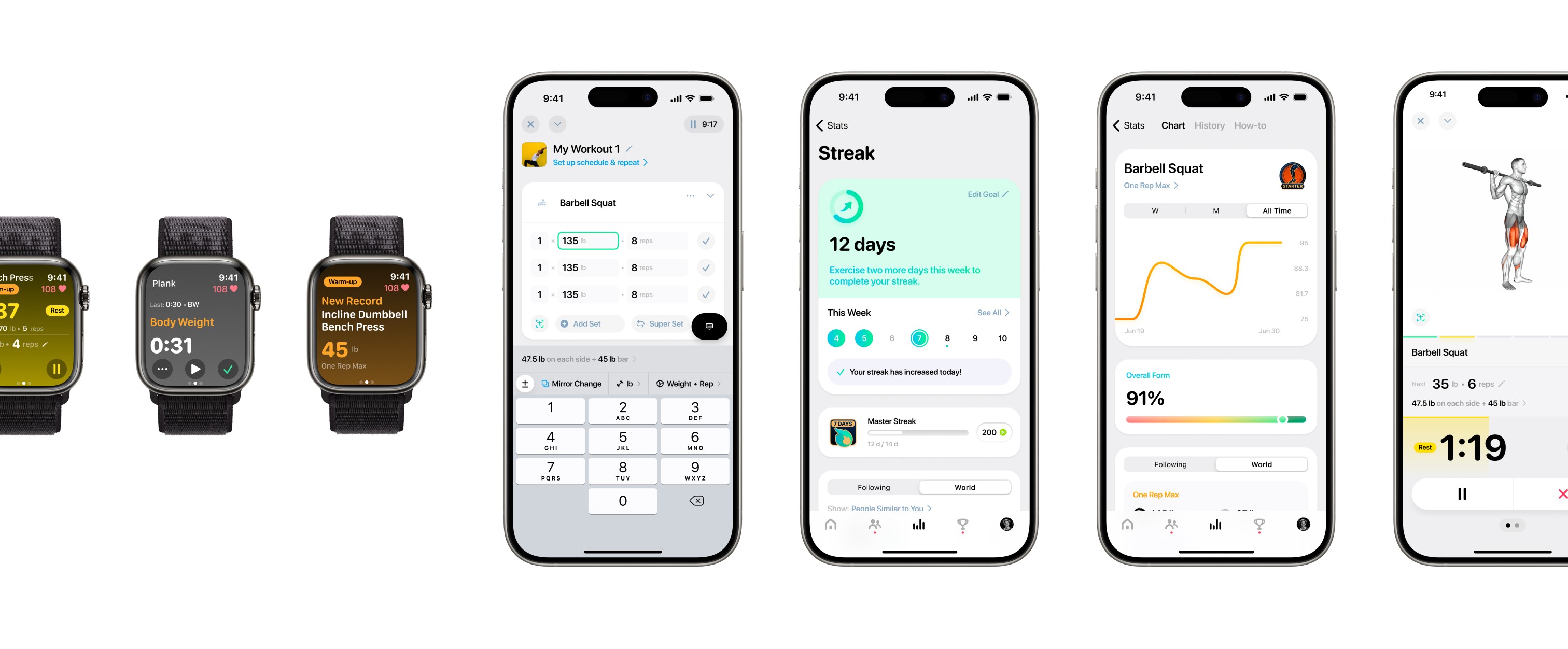
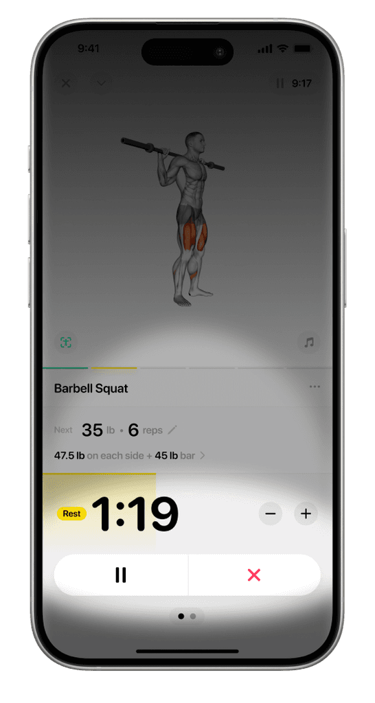
For example, the workout logging and guidance experience is designed to accommodate a range of complexity during a workout. The most common features, such as rest timer controls and set information, are prominently placed at the top of the information and visual hierarchy, while more advanced options are organized with leads surfaced at relevant points. This layered structure has brought order to the dozens of features needed in these views, with their discoverability gradually increasing with complexity. This approach allows people to learn and navigate the UI at their own pace. As they become more advanced in their fitness journeys, people are often surprised by how deep and powerful the tool can be.
Consistency, in and out.
The experience is more approachable when it’s familiar and predictable, and the Flex design system provides the building blocks to make that happen. Platform human interface guidelines were thoroughly studied and referenced to ensure external consistency, while UI elements were carefully planned and defined in detail to achieve internal consistency as well as a distinctive Flex look and feel.


UI ergonomics
Since this app is designed to be frequently used while multitasking (like exercising), I wanted the UI to be easily accessible with minimal finger movement. The important UI elements are positioned toward the bottom of the display, especially in views used during workouts.
Inclusivity
I wanted to build a welcoming and honest environment that encourages intimate interactions, rather than adopting a visual style that comes across as "tough" and "masculine." From my conversations with people, I've learned that they have different goals and expectations for their bodies. An unbiased visual foundation respects individuals by avoiding assumptions and, consequently, intrusiveness. This "transparency" also reduces unnecessary cognitive load, enabling more comfortable interactions.
Unbiased, meaningful, and visually pleasing imagery and graphics design in the app.
Sparks in the night.
Celebrating and enhancing delightful moments.
The path to achieving fitness goals can be long and sometimes disheartening, with small progress often going unnoticed. Yet, it’s these subtle advancements that ultimately lead to significant results. My goal was to design the app in a way that highlights these rewarding moments—whether it’s completing a single set or finishing a weekly streak—reminding users that the effort they put into self-improvement is both valuable and beautiful. Progress may be gradual, but it’s always happening.
Instant positive feedbacks
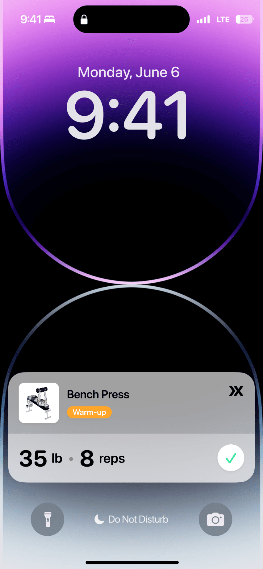
Not all achievements are big and flashy, and the ways we celebrate them don’t always need to be either. I carefully crafted many design details to provide positive feedback—from the subtle yet satisfying sound and haptic response when logging a set, to the more substantial animation when completing a workout. It’s crucial not to overdo these animations or overwhelm the user; each one should complement the moment with purpose. For instance, the workout completion animation not only indicates how much of the workout session was completed but also naturally guides the user’s attention to the workout calendar, showcasing their progress.
Interactive Hi-Fi prototype built for the workout session summary design concept to make sure every detail looked and felt right.
Haptics and sounds are designed for important actions.
Building interactive prototypes has become a key part of my workflow. Tools like Origami, Figma, and SwiftUI were used for the motion design in Flex.
Sense of progression
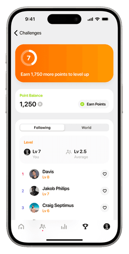
To encourage and reward long-term progress, gamification was a key design strategy. Elements like achievements, points, and leaderboards were integrated to make progress feel more tangible. However, since gaming elements can be overwhelming in a fitness app, I focused on striking the right balance between maintaining a low cognitive load and promoting high engagement. The gamification features were designed with the same delightful aesthetic, emphasizing approachability and consistency, while also incorporating playful touches in subtle details like interactivity and graphic design.

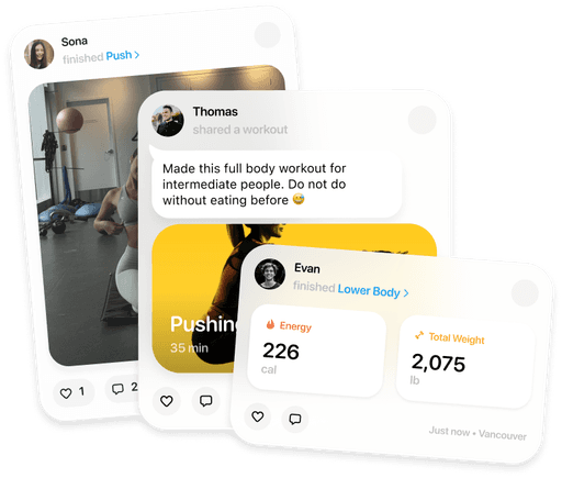
Visualizing long-term progress boosts engagement by making achievements tangible, motivating people even without immediate results. Combined with an in-app social network, they can share milestones and celebrate with a community, fostering accountability and support. This approach enhances motivation, satisfaction, and long-term retention, creating a deeper connection with the app.

Flex is now available for iOS and watchOS on the App Store, with the Android version in development.
Related Links


