VCard
2010 - UI Design
In 2010, Sina Weibo, a Twitter-like social network in China, reached its first 10 million mobile app users. That same year, Apple announced the iPad, which quickly became a global sensation. However, there was a gap between iPad users’ expectations of the Weibo experience and what Sina offered. In response, I collaborated with my classmates to develop a Weibo reading app. Our app was installed on over 2 million iPads and received a 4.5 out of 5 rating over its lifetime. This project became my first successful experience with user-centered design iteration.
Discovering the Gap
People wanted an engaging and fun Weibo app that fully utilized the iPad’s capabilities.
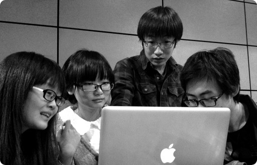
After reading top reviews for the official Weibo iPad app on the App Store, I compiled lists of user frictions and expected features. I then organized a meetup with four frequent Weibo users, having them share their thoughts while interacting with the app. This allowed me to refine the lists and create a mind map based on user insights. Since the app was for a new platform, I used Apple’s selling points for the iPad as a foundational starting point.
Based on the preliminary answers to core design questions, I created a prioritized feature grid to guide the design process.
From the basic features, I established root nodes for the information architecture and began building the flow.
Building the Foundation
Recreating the digital magazine experience for Weibo.
Starting with the mind map and feature grid, I sketched the initial version of the information architecture, incorporating a basic flow. This was the point where the design began to take shape and become more clear and solidified.
Building on the initial information architecture and flow, I used wireframes to develop rapid prototypes and validate logic. To enhance team communication and alignment, I then transformed these wireframes into interactive Keynote prototypes using placeholder assets, showcasing the UI logic and design. This approach replaced the need to present complex wireframe flows, streamlining feasibility checks and decision-making through clear, interactive slides.
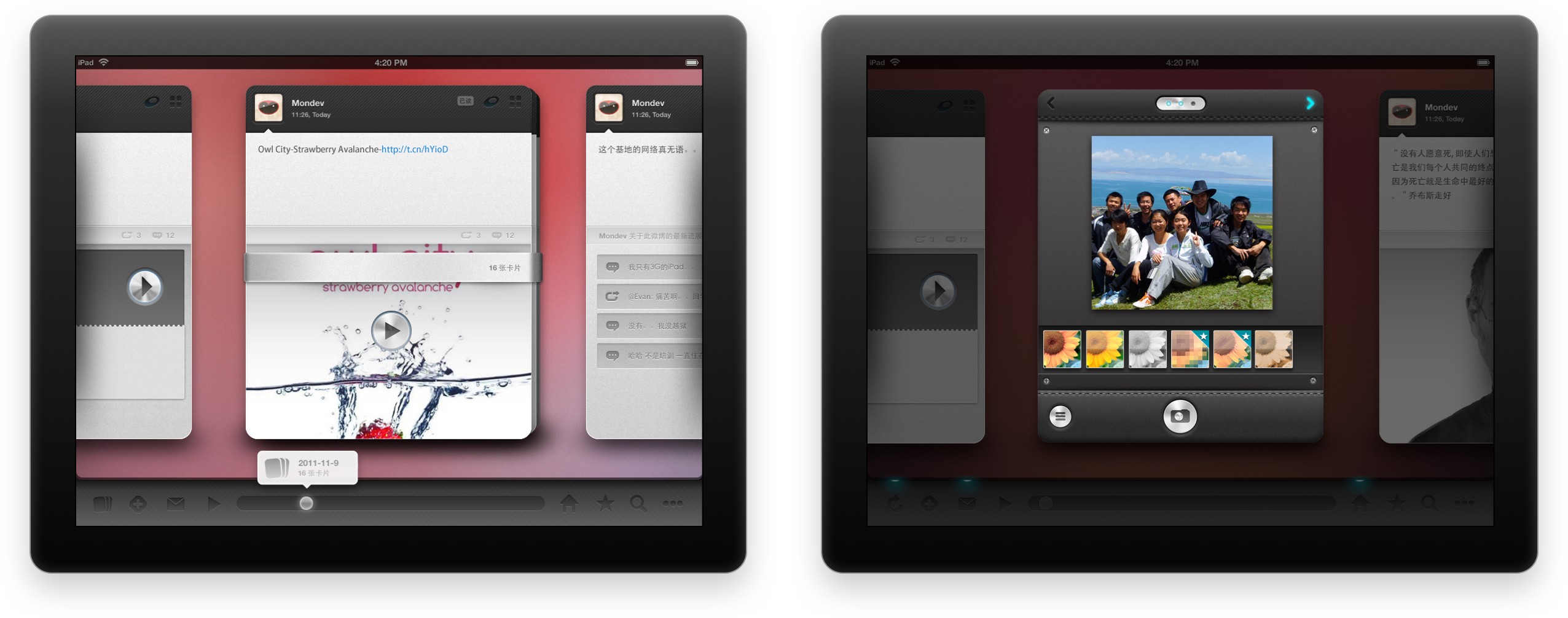
Before long, the Keynote prototypes successfully passed our internal logic and feasibility checks, allowing me to begin creating the first high-fidelity UI mock-ups for an initial ad-hoc test. Later, we presented our first MVP prototype to a group of selected users.
MVP Test
Spotting the issues.
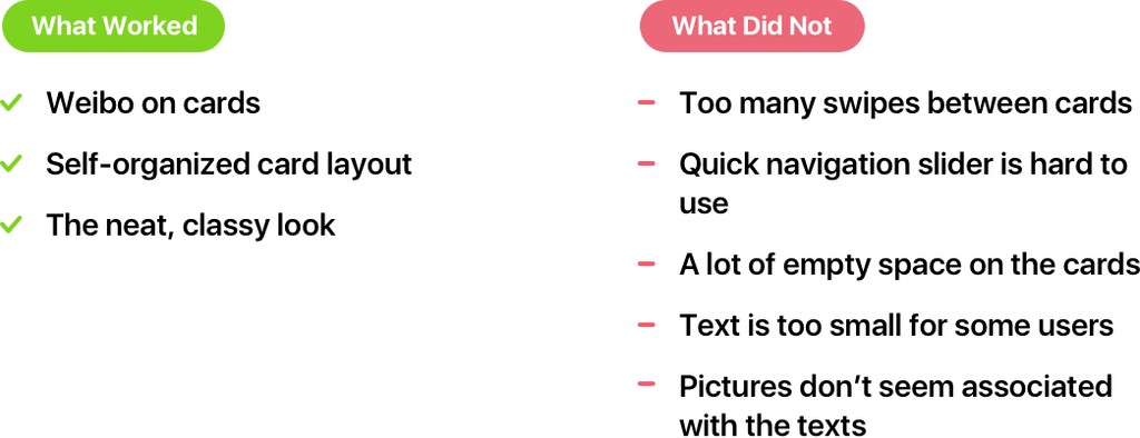
The prototype introduced several well-received innovations that became part of the foundation for the launch version. More importantly, we focused on learning from the ad-hoc test users to create a solid launch version. I compiled a simple table highlighting what worked and what didn’t for the two core features of our minimum viable product.
Cards Flow
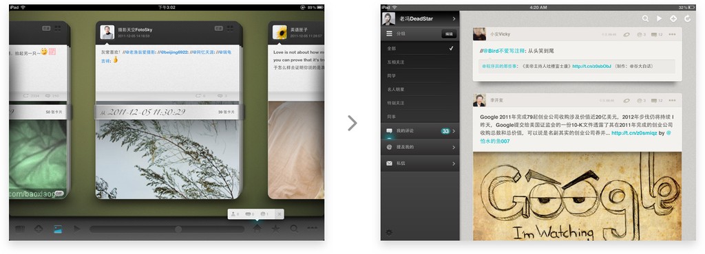
For the first time, Weibo was organized into ‘cards’ on the digital screen. Each post’s content was neatly arranged and accessible with a single tap. The large cards highlighted the content, allowing people to swipe or flip through them, similar to reading a magazine or viewing a digital photo frame.
Hub
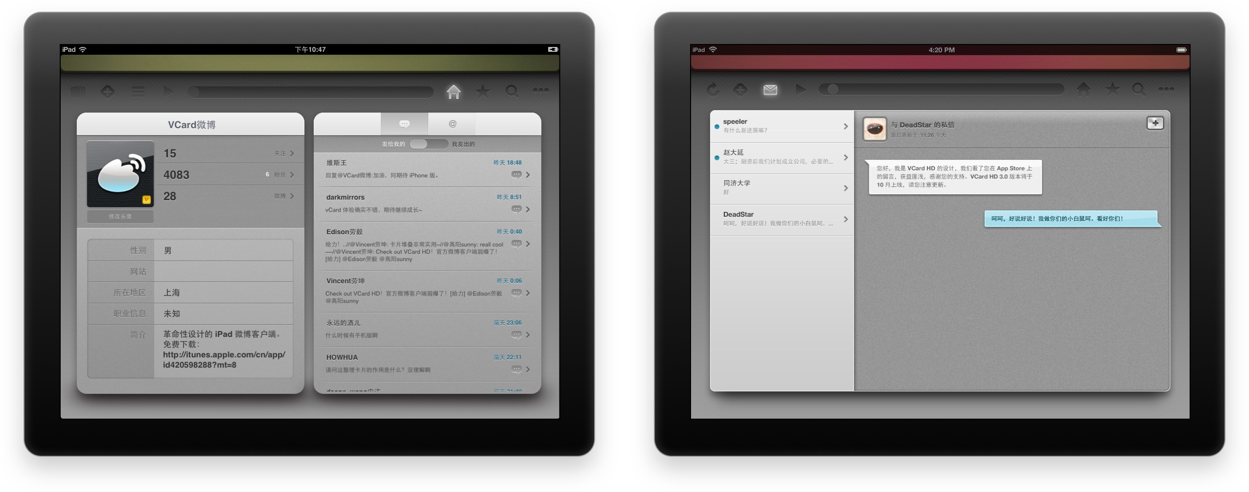
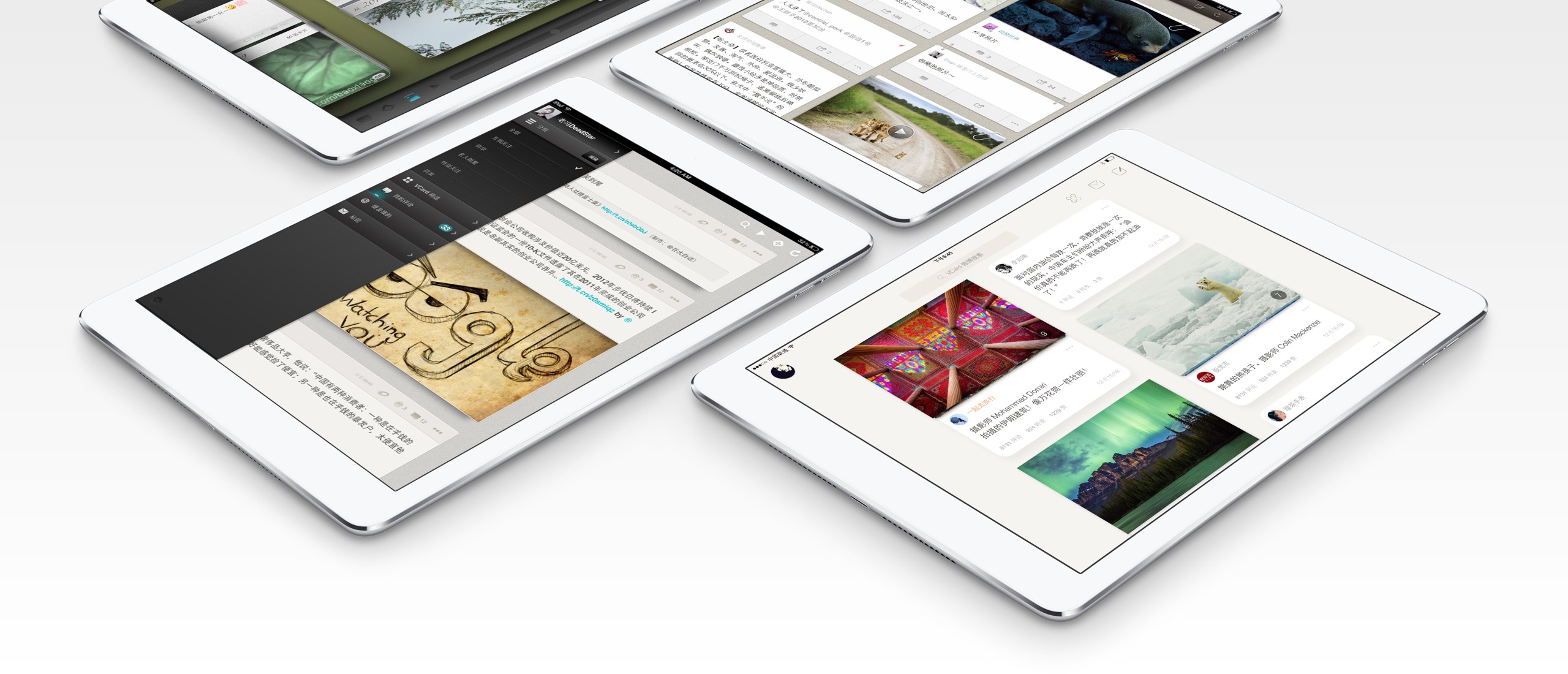
The hub was designed as a personal centre for people, allowing them to easily check and manage comments, reposts, and followers. The interface logic was simplified so that people could access all frequently needed information at a glance. While this design might seem obvious today, it was surprisingly absent from the official Weibo iPad app at the time.
Iterating for Launch
"Issue, Change, Action."
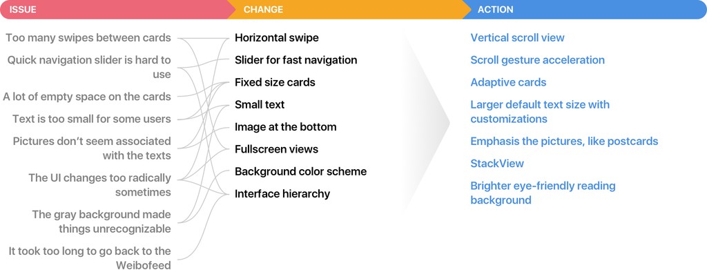
While users embraced our core idea, the UI foundation remained far from solid. With the feedback tables in hand, I created an ‘Issue, Change, Action’ map to identify the next steps that needed to be taken.
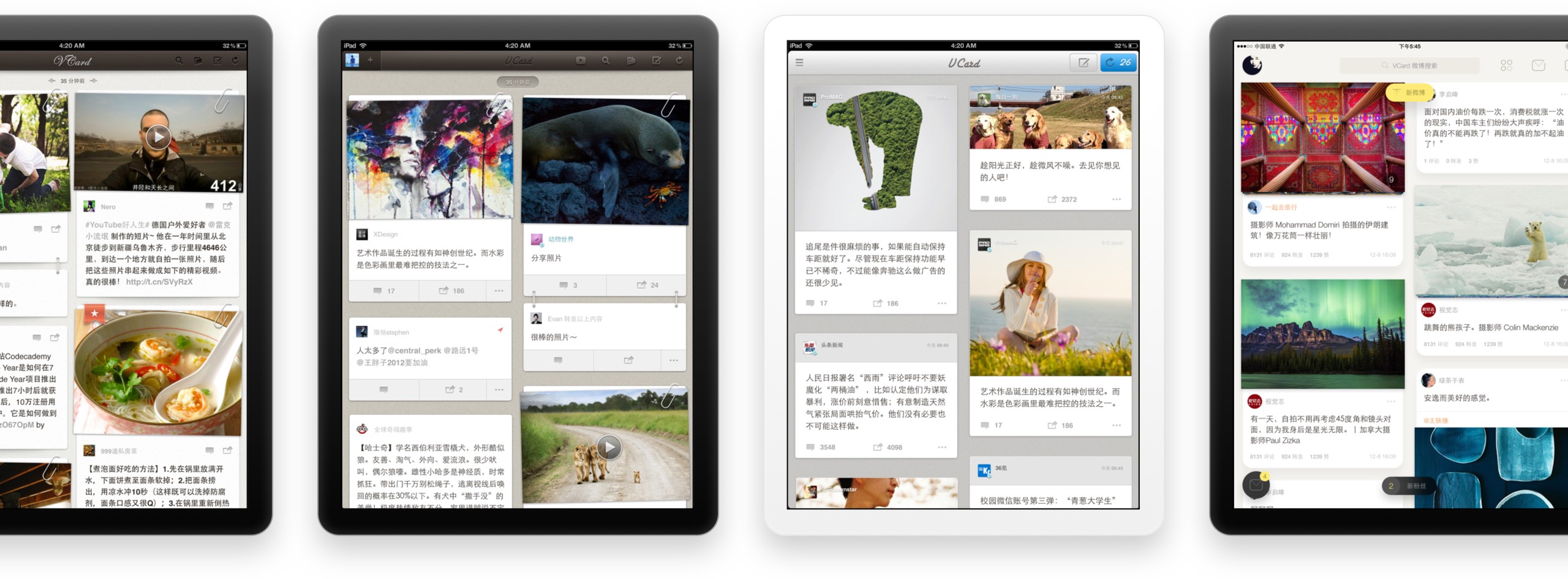
Based on the actions identified, the most crucial change was to the Weibofeed. I redesigned the cards to make them adaptive to the content, reorganized them into a vertical scroll view, and adjusted the color scheme of the feed interface:
The revamped design received better feedback, but we encountered a new issue: the cards were too wide, resulting in longer text that required more horizontal eye movement for each card.
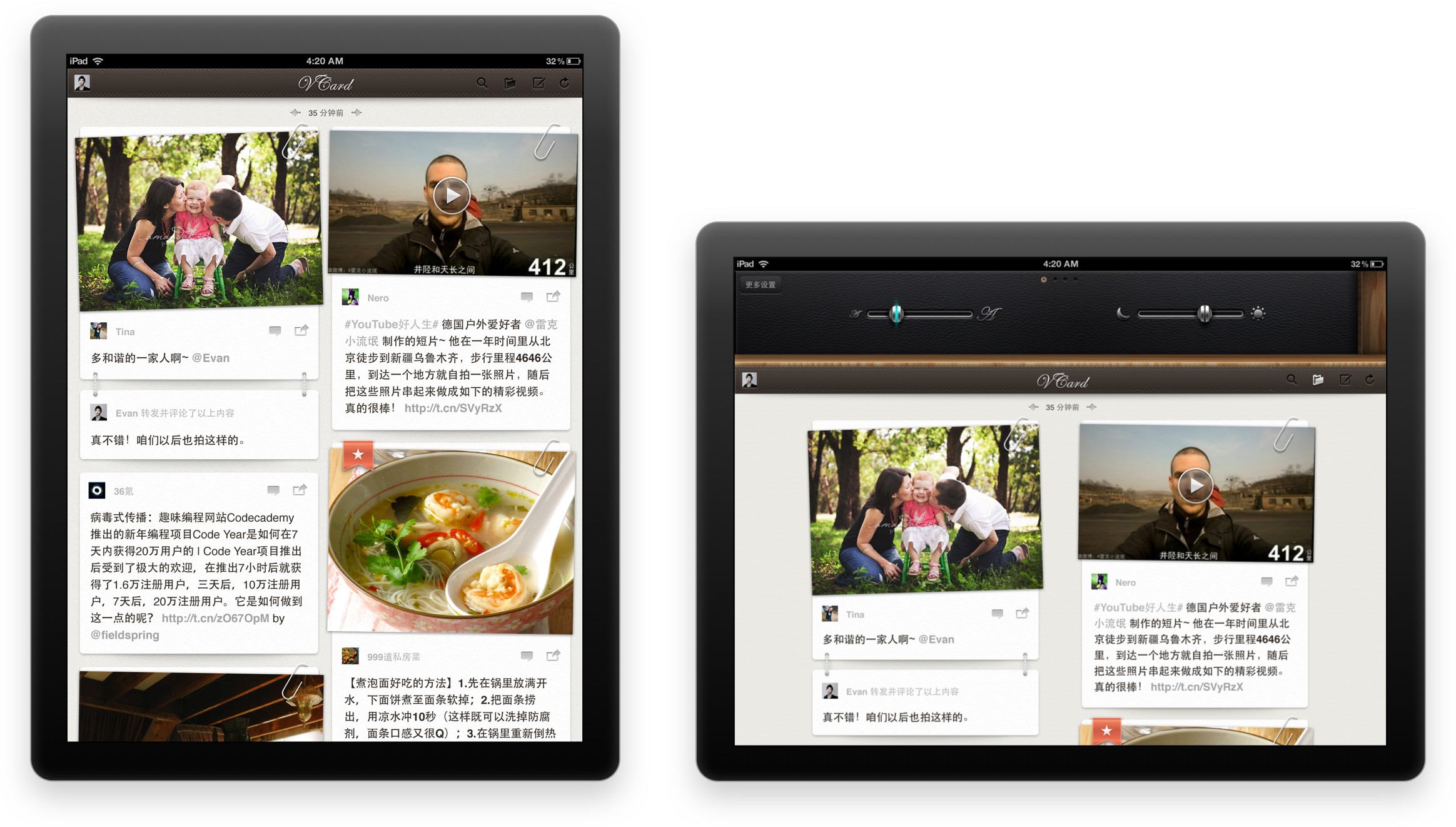
Inspired by editorial designs in magazines and newspapers, I created a double-column Weibofeed with adaptive Weibo cards. Along with other polished features like Stack View and Composer, we ultimately achieved a production-ready design for the launch version and began development.
Weibofeed
The neat double-column cards leveraged the iPad’s large, multi-directional canvas, providing a rich yet organized content layout. I designed several gesture controls to allow users to interact intuitively with the interface.
Stack View
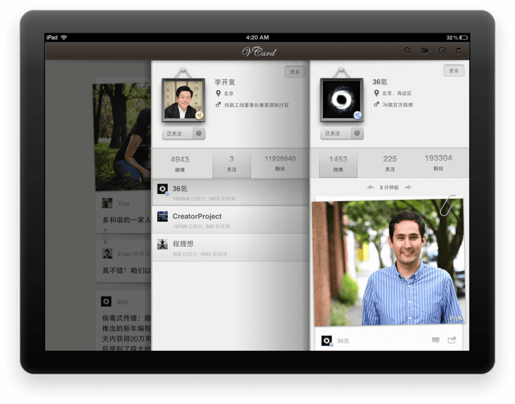
Rather than requiring users to switch screens each time, I designed a Stack View to connect the parent view and child views. Users could swipe left and right to navigate between the views, while the avatar frames would wiggle horizontally to provide clear affordances.
Composer
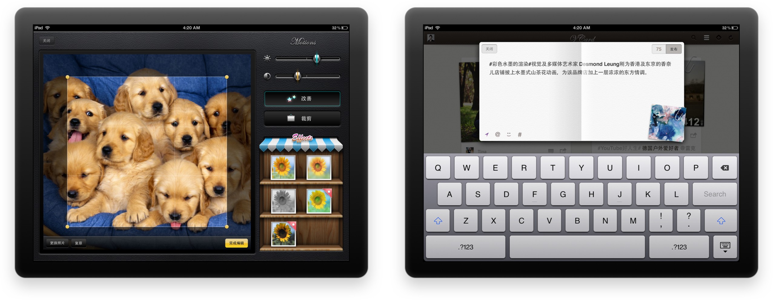
For the first time, users could edit and post pictures on Weibo using a single app. We provided a well-crafted photo editing tool integrated into the Composer. This tool utilized native iOS graphics technology and featured an easy-to-use interface.
Debut
Over 2 million people installed our app and they loved it.
After launching the version on the App Store, I recognized the need for a new process to gather user feedback and facilitate ongoing iterations. As we were developing a social networking app, we had the opportunity for more direct interactions with the user community. To capitalize on this, I contacted Sina and established a verified app page on Weibo.
The VCard Weibo page was the best community-centered design tool I had ever created.
We gained 23,437 followers after an update that added a link to the Weibo page for the app, leading to a flood of comments. This page allowed me to connect more closely with end users and respond quickly to their feedback. Throughout VCard’s lifetime, we implemented more than four major updates and countless small fixes, and people appreciated our commitment to improvement. According to data from iTunes Connect, VCard reached its 2 millionth user in 2013, maintaining a rating of 4.5 out of 5.
Reflection
Designing software UI is an on-going, collaborative process that requires an open mind.
As my first real-world practice, designing VCard provided me with a deeper understanding of adaptability and resource management. The crucial aspect of a project is not strictly following a fixed process but being agile enough to evolve and find the best solution in varying situations. For example, I could have utilized more low-fidelity wireframes for the ad-hoc test and subsequent internal iterations, which would have been much faster. At that time, a complete design process for ideation proof was unnecessary. I came to this realization later, modifying the design iteration process after the app launched, which helped the team respond more efficiently to our growing user base.
I highlight this more-than-a-decade-old project here because it marked the beginning of my journey toward self-awareness as a product designer. Working with my team, I learned to be adaptive and solution-oriented rather than strictly following rules, as well as how to communicate more effectively with developers by speaking their language. Facing millions of users for the first time, I truly realized the vital role users play in the product design process. There is simply no ‘final’ version; both the product and the design process, along with the designer, must continuously adapt and evolve.
Related Links


