Huawei
2016 - UI Design
Huawei, a long-term partner of our research center (CDI) at Tongji University, hired my team to help redesign their aging NIC (Network Information Collection) module, part of their network management system toolkit.
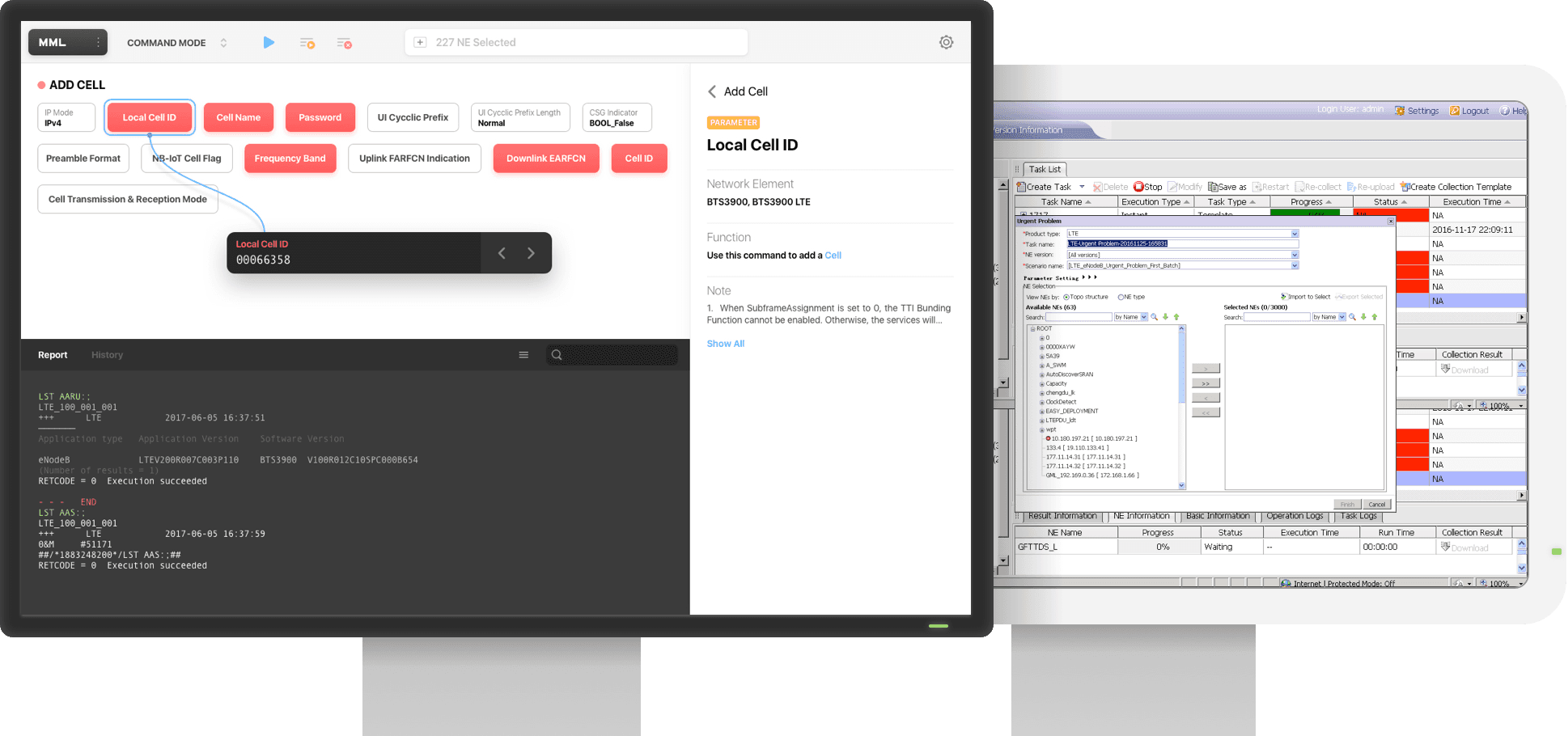
The NIC module allows network engineers to send maintenance tasks, such as status checks or performance inspections, to network hardware. It also links to a command editing tool (MML) for creating and sending custom commands.
Building empathy.
We role-played as NMS engineers to ensure a balanced collaboration.
To truly understand the NIC, we spent a week at Huawei, working daily like new employees, learning and using the system hands-on. This gave us an unbiased, in-depth understanding, which led to more productive discussions with the client. During the project orientation, we shared insights and aligned on the key issues and goals.
Next, we listed pain points, design goals, and challenges.
Our role-play and discussions revealed that the software was overloaded with unnecessary features and hindered by a confusing, outdated UI. We then identified the primary pain points…
Redundant functionality, heavy and outdated UI
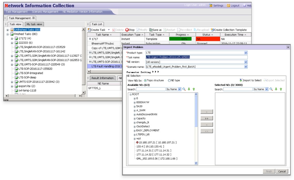
The software appeared intentionally complicated to seem ‘professional,’ featuring a double-wrapped tab menu and a universal menu bar. The task list displayed an overwhelming amount of data, much of it irrelevant, based on our time with the engineers.
Tedious and time-consuming data input
Preset and customized tasks are the most common use cases for the NIC and MML. However, more than 20 unclear parameters must be filled out for each task, presented in an unrecognizable, cluttered table.

Confusing terms and parameters
With over 150 parameter types, each varying based on the selected network element, figuring out what to enter is especially difficult for less experienced engineers. This often doubles the work time, as they require help from senior engineers.
Based on these pain points, we worked with Huawei to set goals and created a roadmap to address the main challenges.
With these challenges in mind, we finally had the right questions to ask. It was time to find the answers directly from the users.
Listen. Listen. Listen.
We interviewed expert users and gained valuable insights into the challenges. From there, we tried, tested, and iterated based on their feedback.
Designing for a professional niche for the first time, listening became more crucial than ever. We began by speaking with several senior NMS engineers, gathering their ideas and thoughts on the challenges we identified. It felt like a hybrid between a brainstorming session and an interview, facilitated by us as designers.
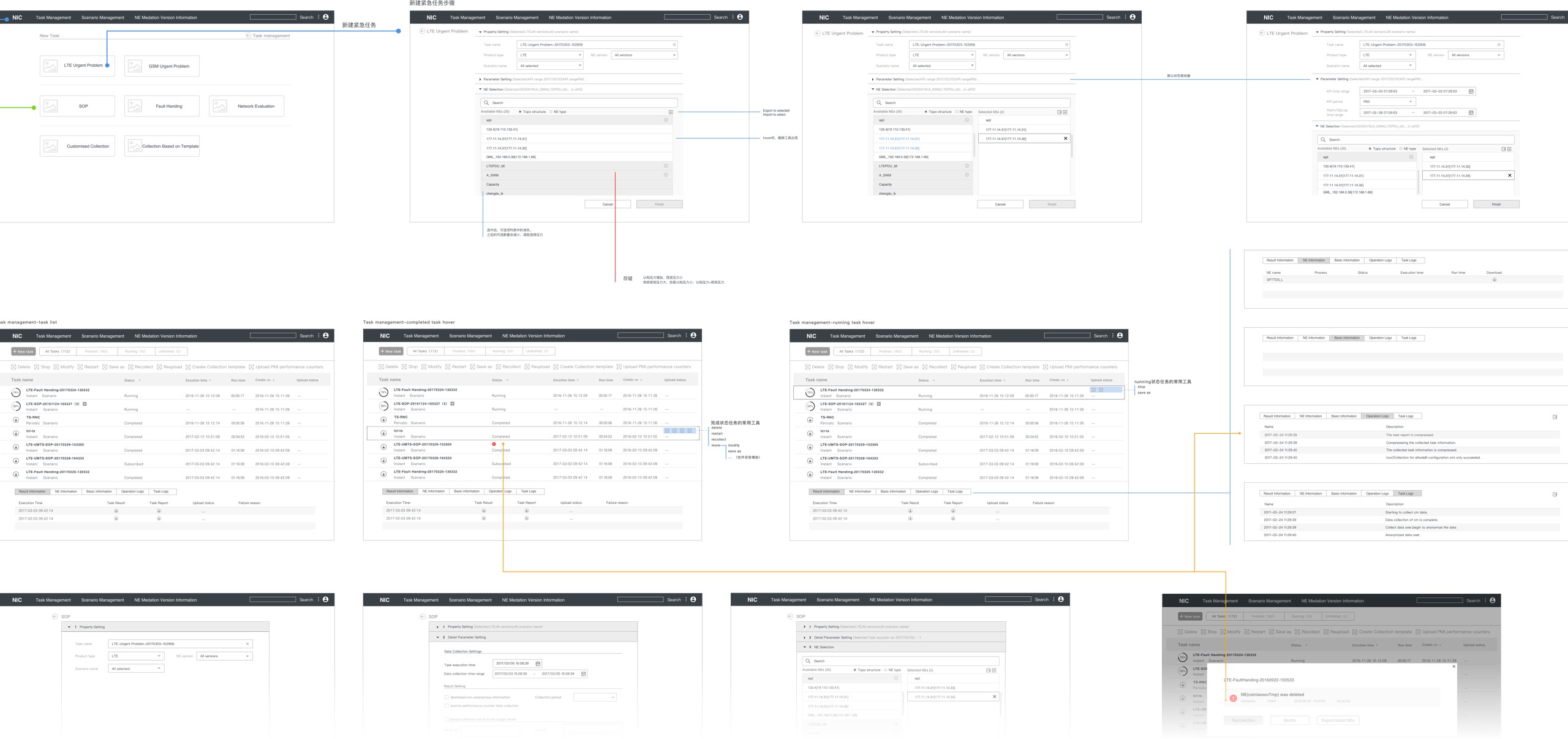
I led the team through several rounds of testing and iteration. Rather than keeping things strictly Lo-Fi until the final stages, we included visual elements in some early versions, as one of our key goals was related to visual design. These tested visual components ultimately inspired the overall UI design.
Countless small improvements gradually brought us closer to the goals we set at the start.
We’ve made things better.
Creating an expandable foundation—a tangible inspiration for something even bigger in the future.
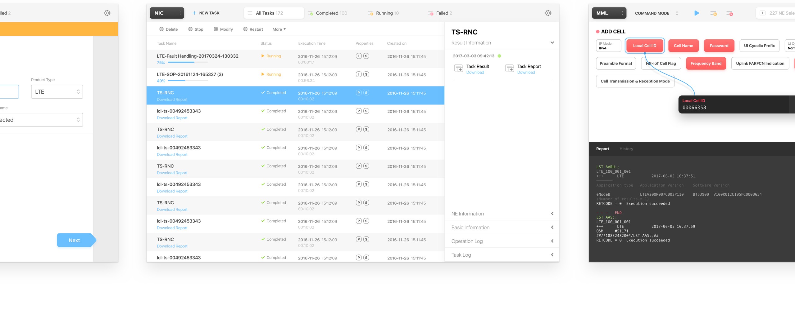
The end result was dramatically improved compared to the original version, yet remained humble and unobtrusive when users engaged with it. We simplified the product through thoughtful reductions, without compromising functionality, and introduced innovations that enhanced the workflow without disrupting the user experience.
Universal Navigation
The clumsy multi-layer navigation was reimagined as a single tab bar that consolidates all the necessary portals for users. This design also offers basic data previews and features a more visually appealing layout.
Guided Task Generation
The endless table of text fields was transformed into guided step pages with clean UI elements. To help users confirm the entire setup before submitting the task, each step displays a summary as they progress. This design provides users with a complete overview of the task without causing distractions.
Quick Fill for MML
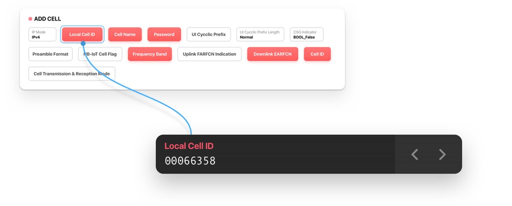
When filling out cells in a long table, users often find their attention shifting between rows. The quick fill feature allows users to jump between data items without altering the position of the input area. Additionally, the command table was replaced with a clearer and more intuitive ‘block’ view, made possible by the innovative item-input isolation design.
Built-in Wiki for MML
A context-based wiki was integrated into the MML module, allowing users to view definitions and instructions for the selected parameter directly within the interface.

Reflection.
Designing for the users, with the users.
Almost all the projects I’ve undertaken in recent years have involved user collaboration, and our work with Huawei was a prime example. We learned from users and collaborated closely with them. In this case, I recognized the critical importance of asking the right questions and listening attentively. Achieving our goals would have been far more challenging without the cooperation of designers, clients, and experts.
While designing this professional tool, I realized how even a small design decision can significantly influence user behavior. It’s essential to test and observe changes to ensure they guide users in the right direction. A truly successful design not only supports existing workflows but also, more sustainably, leads users toward improved processes.

