Huawei
2017
Simplifying the Workflow for Professional Users
Team
Me (Design Lead, Visual Design)
Xiaohua Sun (Supervision)
Jinglu Li (Research)
Le Gao (UX Design)
Tools I Used
Sketch
WebStorm (JavaScript)
Link
Huawei
Huawei, a long-term collaborator of our research center (CDI) at Tongji University, hired my team to help them reimagine their aging NIC (Network Information Collection) module in their network management system, which is a multi-module toolkit for different tasks in the network management workflow.
The NIC module we were tackling serves as an interface for network engineers to send tasks to the network element hardwares for maintenance purposes such as a status check or a performance inspection. The module also links to a separate command editing tool (MML) for users to edit and send customized task commands.
1
Don’t say anything…not yet.
To build an equal collaboration with Huawei, we role-played as NMS engineers before everything kicked off.
Figuring out issues of a complicated professional tool like NIC can be challenging without deeply understanding the workflow, so we spent a week at Huawei to actually learn and use the system. We went to ‘work’ at 9 AM every day during the week, just like every other rookie employee.
Having such hands-on experience before the kickoff discussion helped the team build a thorough unbiased first-person understanding of the product that enabled an equal conversation later with the client.
With the background knowledge, we conducted a project orientation meeting with Huawei, where we shared thoughts about pain points with each other. The conversation was smooth and mutually inspiring as we were not only taking inputs from the client but also outputting our findings, and everyone reached alignment about the core issues and goals before the end of the meeting.
2
Now back to the classics.
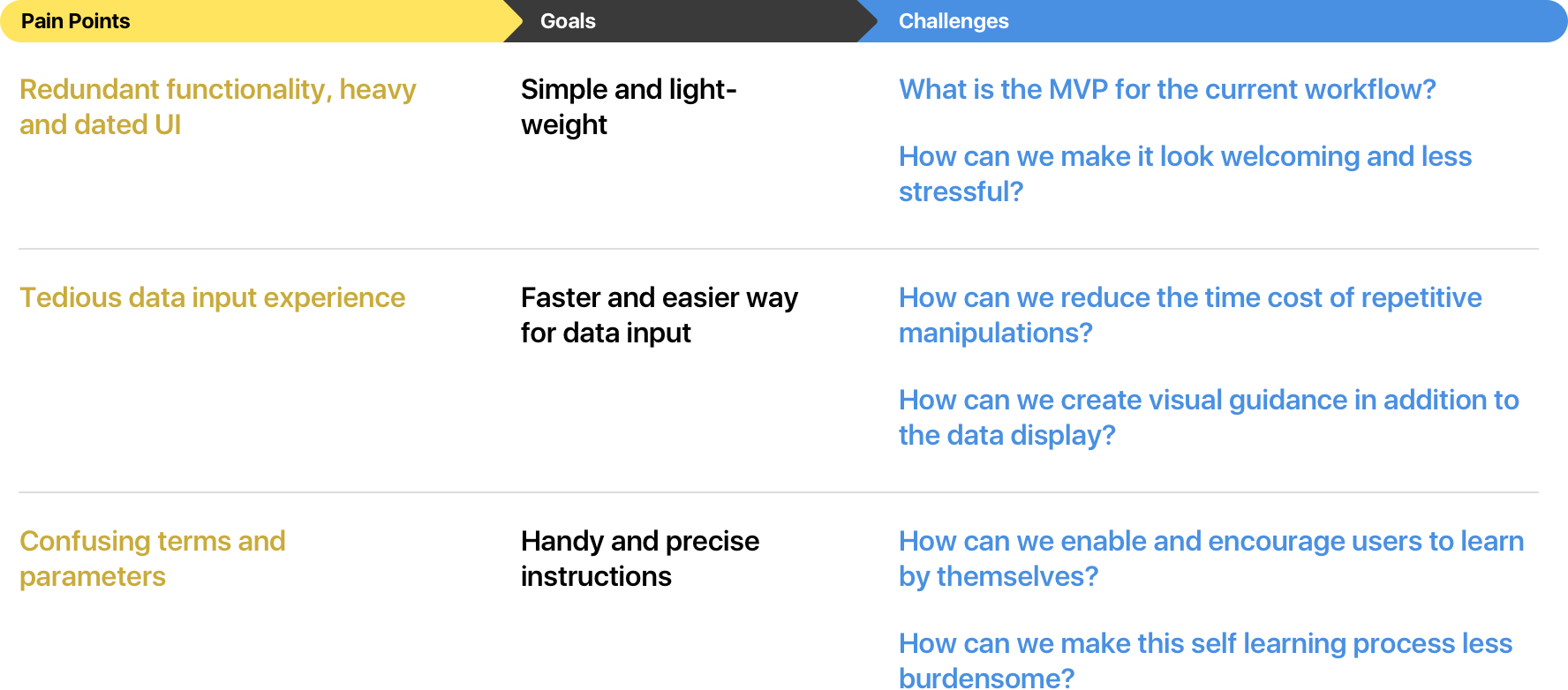
We listed pain points, from which we listed design goals, from which we listed challenges.
Based on the role-play experience and the discussion with Huawei, we thought the problem was that the software was overloaded with unnecessary features displayed by confusing last-generation UI. To be more specific, we listed the main pain points.
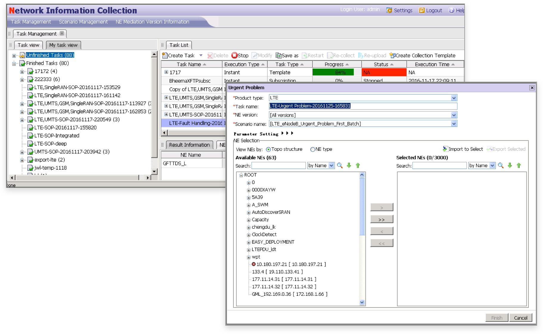
The software was overloaded with unnecessary features displayed by confusing last-generation UI.
Redundant functionality, heavy and dated UI
It seems the software was designed to be complicated on purpose to make it feel ‘professional’. The base structure is a double-wrapped tab menu with a universal menu bar in addition.
The task list shows every data item you can ever imagine, even though many of them are actually useless according to our experience with the engineers.
Tedious and time-consuming data input experience
Creating preset and customized tasks are the most frequent (if not the only two) use cases for the NIC and MML, and there are more than 20 obscure parameters that need to be carefully filled out every time. The current UI offers a long and unrecognizable table of data.
Confusing terms and parameters
As I mentioned before, there are more than 150 types of parameters users might encounter in the software, and each of them has various versions based on the selected network element. Figuring out what to type in is frustrating especially for non-senior engineers, which usually doubles the work time because of the extra needed help from a senior engineer.
Based on the listed pain points, we set up the goals with Huawei and made a roadmap showing the main challenges for achieving the goals.
With these challenges in mind, we finally had the right questions to ask, and it was time to find out the answers with users.
3
Inspired by the users.
We interviewed the expert users and gained inspiration from their answers to the challenges, then we tried, tested, and iterated.
Designing something for a professional niche for the first time, listening has never been this vital in a process. We kicked off with a talk with several senior NMS engineers, asking for their ideas and thoughts about the challenges we listed. It was like a brainstorming session combined with an interview, which was facilitated by us the designers.
Wireframe flow of the second iteration (partial)
I led the team through several rounds of test-iteration afterward. Instead of keeping things Lo-Fi until the final iteration, we actually tried to include some visual elements in some early versions since one of our goals was visual design related. The test-proved visual elements also became the inspiration for our entire UI visual construction later.
The countless small deltas finally led us toward the goals we defined at the beginning.
4
We have made things better.
It is an expandable foundation, a tangible inspiration for something bigger in the future.
The end result was dramatically better compared with the original version, but also humble and unobtrusive when users dive into it. There were reductions that simplified the product without compromise, and innovations that benefited the workflow without alienating the experience.
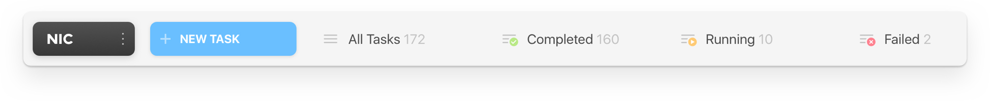
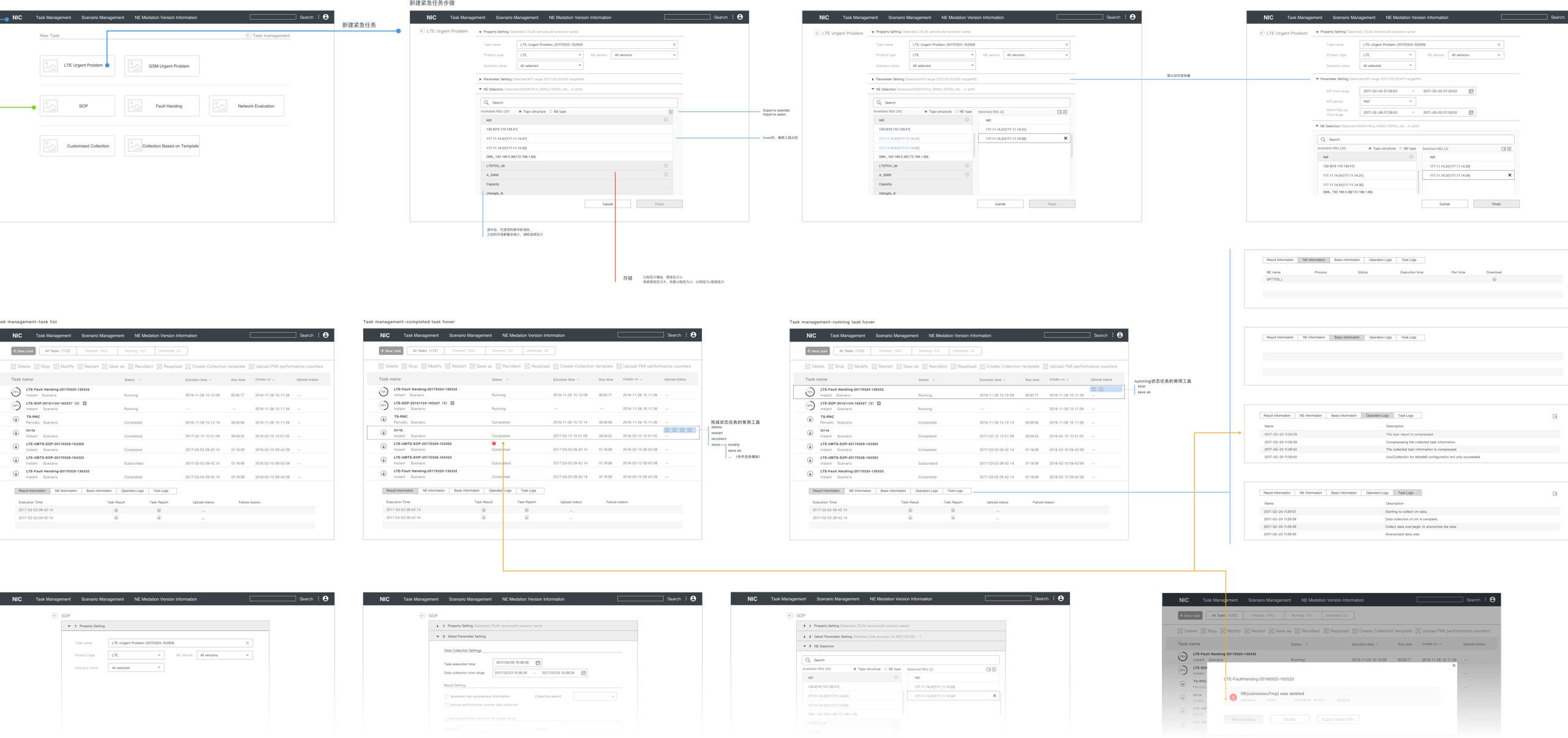
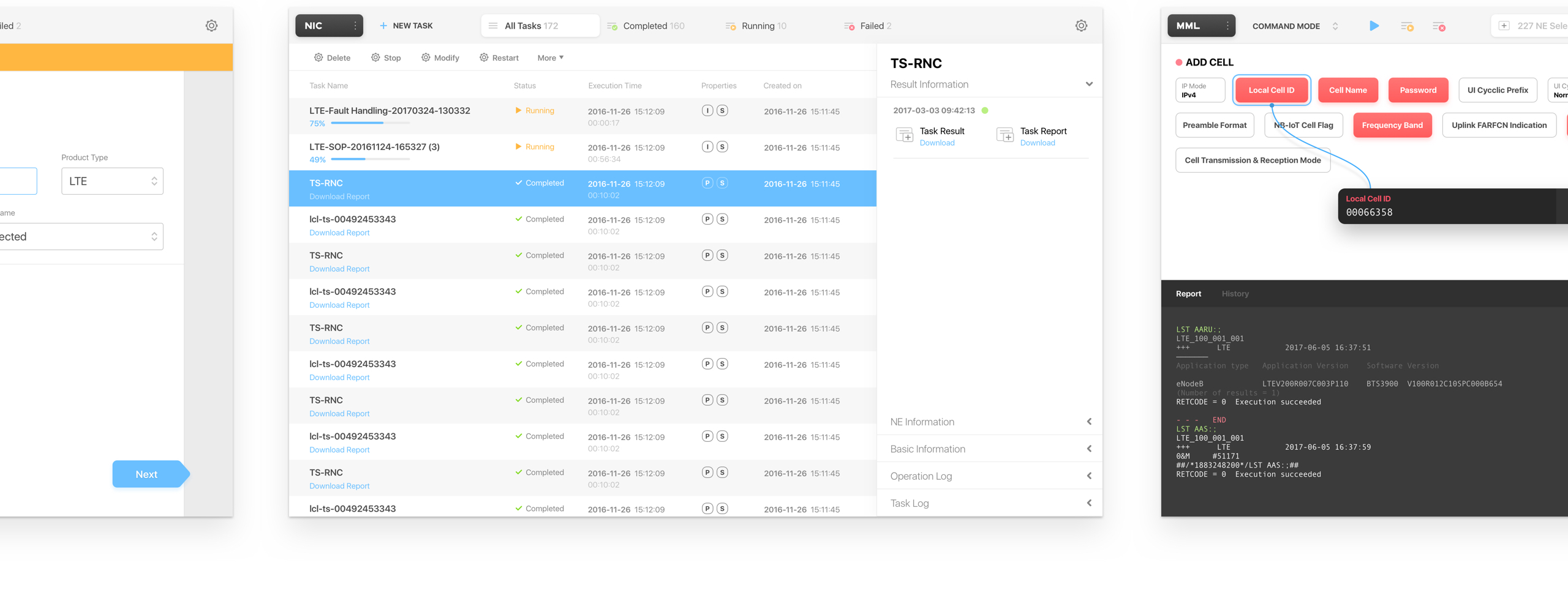
The clumsy multi-layer navigation was redesigned to a single tab bar with all the portals users need. It also provides basic data previews and more delightful visual layout.
When filling cells in a long table, the user's attention is constantly moving between rows. The quick fill is a solution to quickly jump between data items without changing the position of the input area. The command table was also replaced by a more clear and intuitive ‘block’ view which was made possible by the item-input isolation design.
Built-in Wiki for MML
A context-based wiki was embedded into the MML module. Users will be able to see the corresponding definition and instructions about the selected parameter right inside the interface.