Lower cognitive load
Remind people working-out is delightful
Start working-out can be a hard decision to make, and stepping inside a gym for the first time is usually intimidating and overwhelming. Low cognitive load, which I think would be beneficial to any human-being, is especially important for this app working in this scenario.
I envisioned a welcoming, honest environment that encourages intimate interactions. I wanted the app to be “transparent” supporting the content and features we offer, instead of having a visual style makes it look “tough” and “masculine”. What I learned from people, is that they have different goals and expectations for their bodies, and an unbiased visual foundation respects people with not being assumptive and thus intrusive. This “transparency” eliminates unnecessary load added to user’s mental space and enables a possibility of having comfortable interactions.
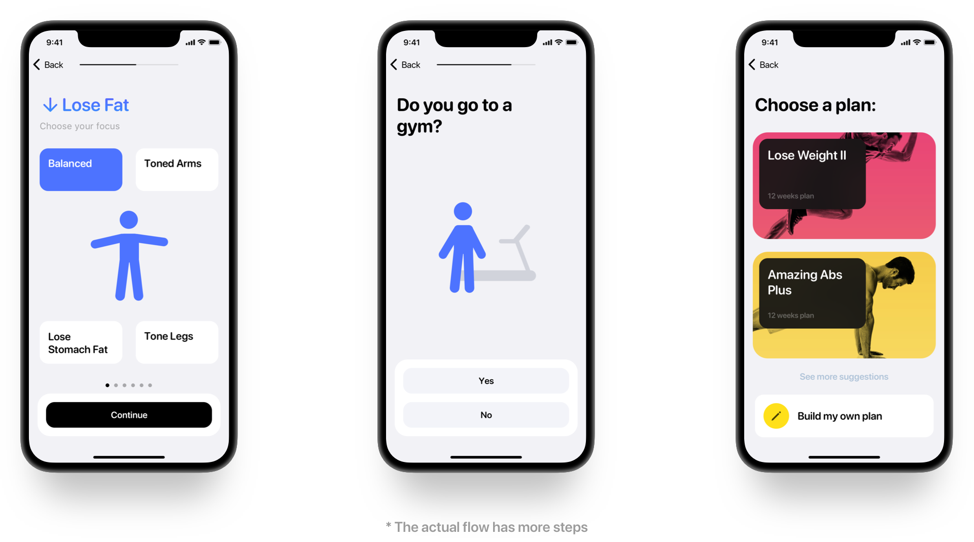
The strategy of lowering cognitive load extends from the look and feel to the UI flows. For example, a step-by-step plan suggestion flow with an animated avatar is designed to on-board the user comfortably without overwhelming them with too many options at once.
However, lowering cognitive load doesn’t simply mean removing stuff. For us, it’s more about the pace of educating the user, as to bring order to the complexity comes from the nature of our use cases. The key is to make the core experience simple and develop easy-to-learn interfaces for advanced tasks.
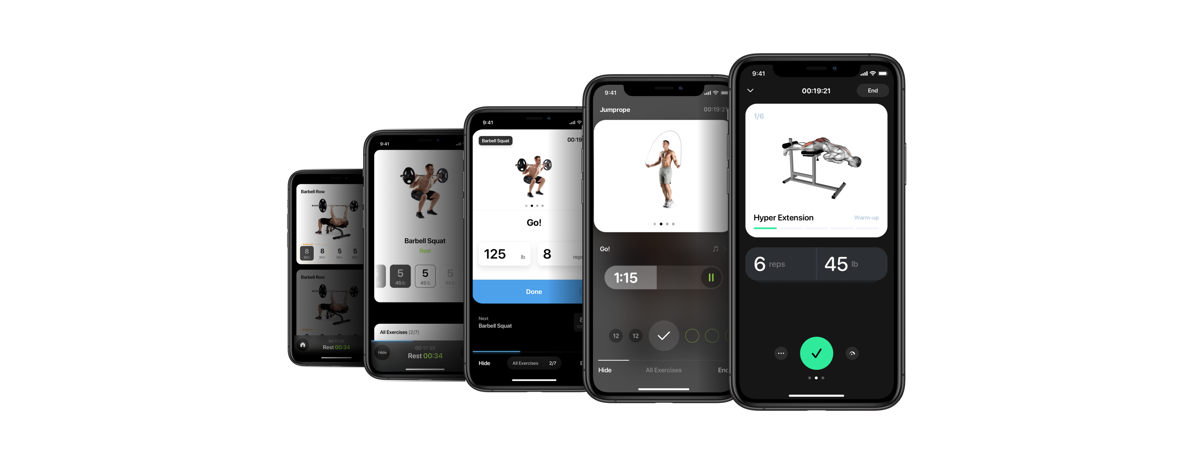
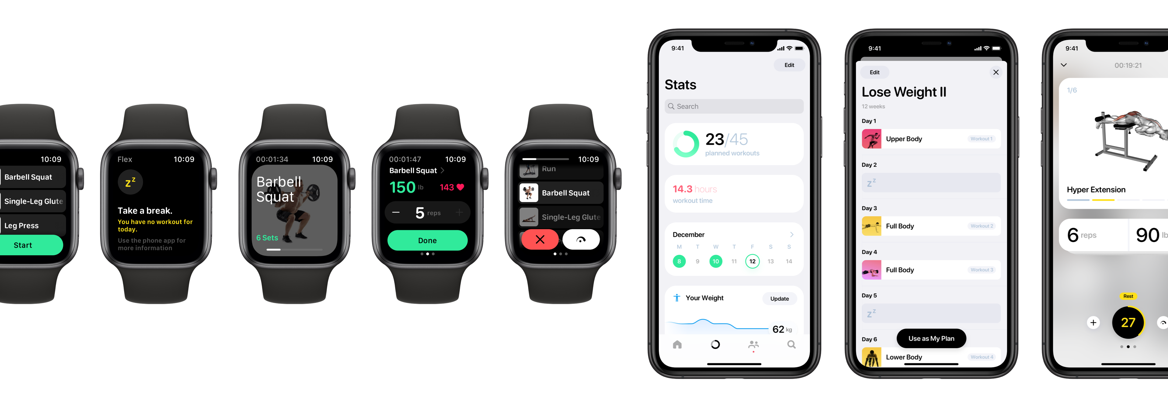
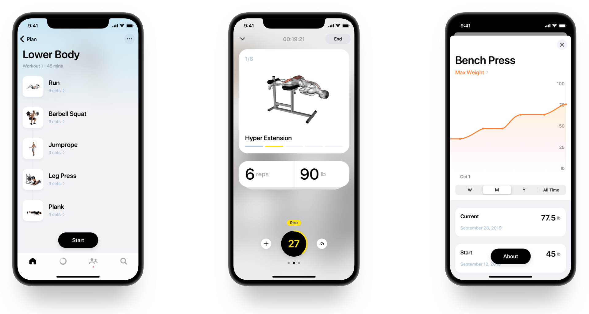
For example, user can choose a workout plan for their goal, start a workout, and be guided through it pretty easily. The interfaces and flows related to these tasks are often linear, with single, distinguishable main interactive elements.
As the user progresses through their fitness plan, they wants more control and tweak their workouts more often, and lots of features built for those needs are often learnt from exploring. So I tried to create a safe and convenient environment with easily reachable and learnable features, based on consistent UI and behaviours. With trust built on a simple yet powerful foundation, people will reward us with a more open mental space.
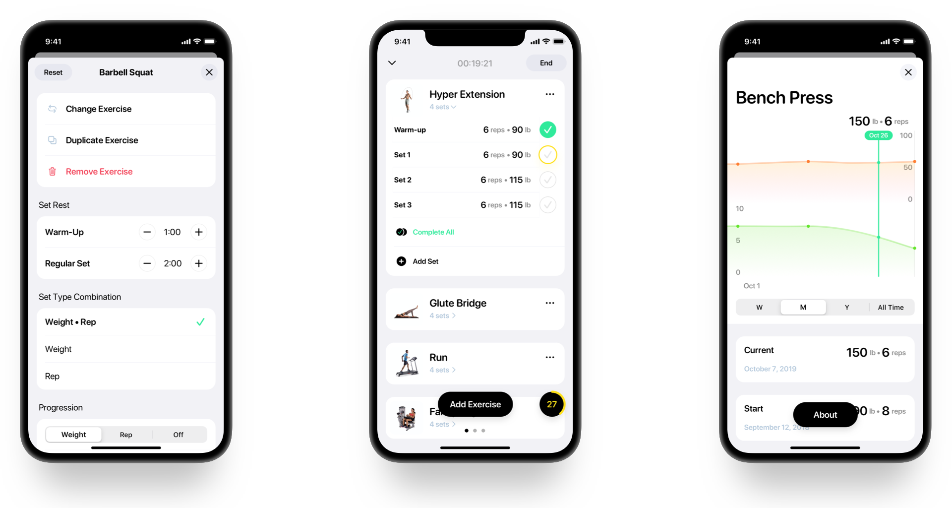
Also, most actions in those advanced tasks such as modifying exercises, creating custom sets, or logging weight values with plate calculation are easily undo-able. All these to make sure that people get things done and gain more knowledge in this process without having the chance to blow things up.
There’re some emotional highlights in the user journey, and I wanted to enhance these moments to build positive connections between the user and our app. For example, a set of data will be visualized to show how much they’ve achieved when the user finishes the entire plan. The avatar with subtle movements and playful transition animation is also to make the start of the journey more exciting.
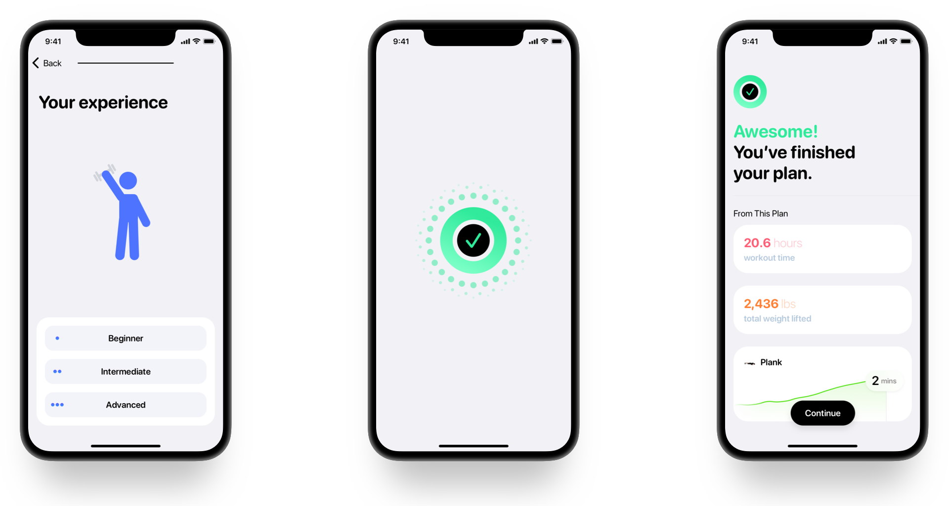
With a mind of restraint, we could also encourage people to do certain things more easily when we put our app as part of those emotional peaks without being intrusive. Like how I added a shortcut for sharing the app in the workout summary screen after the user finishes their exercises. The view is also designed with encouraging and smooth transitions, sound effects, and haptics, to make the moment more engaging.
Flex helps people to start their fitness journey stress-free, and not feel limited or powerless as they grow. The simplicity design makes sure cognitive load is always low, letting users focus on their fitness tasks. With delightful moments and constant emotional rewards, the whole experience will be engaging and enjoyable.
Flex for iOS is now in public beta on Apple TestFlight.